photo Separate_zpsee6734da.jpg  photo about_zps8c821b8c.jpg  photo portfolio_zps8d0d9d7f.jpg  photo bloglovin_zpsa2e5e23c.jpg
 photo 30by30_zps098a90d4.jpg  photo instagram_zpse717f74f.jpg  photo facebook01_zps3b7e857c.jpg  photo Separate01_zps16ecb567.jpg
Showing posts with label black and white. Show all posts

Friday, July 18, 2014

B + W Spring 2014

Some more recent black and white film images from last Spring. The graininess of this film is so dreamy. Landscapes with 400spd black and white are a bit more nightmarish than dreamy, making the California coast to look a bit intimidating:

leaving the beach at sunset
California coast sunset.

Untitled
California coast rocky shore. 

Untitled
California beach looking like the moon.

On the Train
One of the few black and white images I shot while in Japan, on a train from somewhere to Matsumoto. I knew as soon as I took this that it would be a favorite of mine. I'm very pleased with the lighting and napping.

Thursday, July 17, 2014

Summer, 2013

Sometimes it takes a year to develop a roll of film. I'm not sure why, but a lot of the photos I took were out of focus. Could be something with the lens or maybe I was just taking shitty pictures with my glasses on. Most of the images are super grainy (love!) because I used 400spd Illford B+W. Here are some highlights from Summer of 2013:

Untitled
I have no idea where this is. Friends, your thoughts?

Look at that bearded fellow...
Gilroy, CA. At a friends going away party. We are adults and tractors are fun.

Brandon
Santa Cruz, CA. A portrait of my Love in one of my favorite places.

a cut
Tollhouse, CA. That scrape is now a scar 1 year later.

Brandon with Red Dog
Tollhouse, CA. Brandon and Red Dog.

Monday, April 9, 2012

Printing Paper 7


Big Sur Rock 01

Another Rock! I know, I'm a sucker.

This is a weather and ocean worn rock from off the coast of highway 1 near Big Sur not 20 feet away from the ocean. When I was developing this image in the dark room, a few people thought it was a picture of trees. I can see that.

I'm really fascinated with the crevices and round little holes created by water. I understand that water can wear rocks down into new shapes and forms, but at the same time it just seems so impossible to me. Does anyone else weirded out by the seemingly impossible things nature can do?

Thursday, March 29, 2012

Printing Paper 6

As you can see, my California Parks progress digresses into a study of California Geology. This image is shale (still need to confirm) from the California coast of Santa Cruz in Natural Bridges.
Santa Cruz Rock 01
Natural Bridges State Beach was originally named for a an outcropping of sand and rock that used to be a nice bridge out about 100 feet into the ocean. Over time, weather, and eventual collapse, there is no longer a bridge connecting land to sea. It's still called Natural Bridges today, though I've never seen it as a bridge in my lifetime and only in pictures. My dad has a picture he took of the bridge when he was 18 or so.

It's weird experiencing a place like Natural Bridges that is no longer representative of the original reason it was named. Now it's only a history and memory. C'mon people, let's do some deep thinking this lovely Thursday morning. Any places or historical landmarks you can think of that are like this?

Tuesday, March 27, 2012

Printing Paper 5

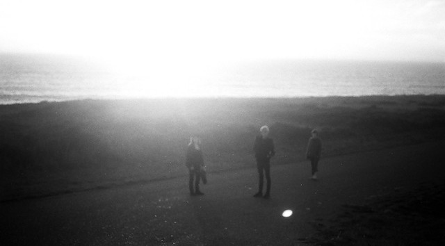
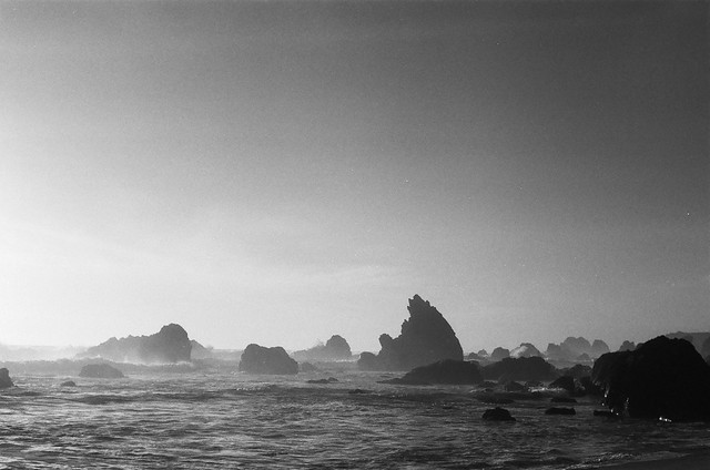
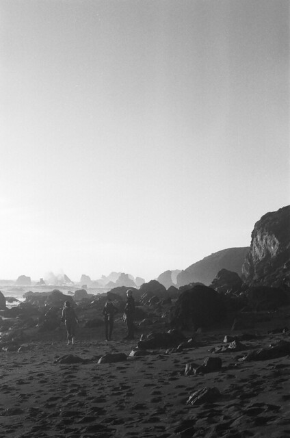
I started a project in winter for a photo class, but so many things happened to me in the last three months that I was never actually able to finish what I wanted to do. I was supposed to have 20 prints finished (not 9, like I do) and the theme was to be cohesive. Well, as projects do tend to turn on me by their own will, my project became more about rocks and California geology rather than California parks.

I'm not a great landscape photographer because I always get so hung up and fascinated by details, which is why I think this project turned the way it did. So I guess I can say my subconscious turned on me rather than an inanimate object, but I enjoy the idea of a project taking on a life of it's own.

Big Sur Rock 02

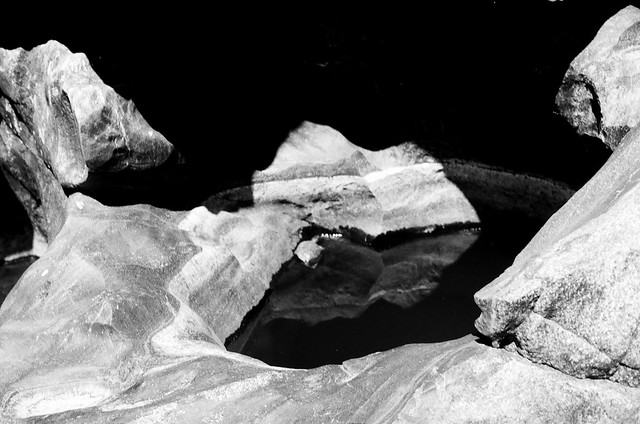
This is a scan of I print I made, which is why there are strange streak marks on the image. This particular rock is from off the coast of California near Big Sur. I love the diagonal separation and texture of this particular wall of rock. I'm going to talk to my geology friend and ask him about why it looks this way. I want to say something about plates shifting and earthquakes, but I haven't studied much geology.

I have a degree in literature, but If I could just keep getting degrees for the rest of my life, these would be my top 5:
  1. Photography
  2. Geology
  3. Oceanography
  4. History
  5. Micology
Do you have a top 5? They don't have to be degrees, but intense learning interests.


Tuesday, February 28, 2012

Studio Failure

Ok, so this wasn't a complete failure but more of a rushed and half-baked attempt to get things done for a project. I have 1 hours to set up the studio, photograph my friend, then drive off to Santa Cruz for an interview.

I really really wish I had access to the studio again so I could redo this. Chelsea and I had a great idea that required me dressing in drag that hopefully we will be able to do sometime in the future. Anyways, here is a behind the scenes look of what we did that day.


On the left, you can see part of the studio and lighting set up. On the right, I just cropped out everything that wasn't Chelsea and the background. I didn't think through the lighting so things came out a little grey and dark. In hindsight, I should have done digital because I'm more familiar with using a digital camera in a studio. Live and learn!


I thought this was a sweet one of Chelsea. This "failure" made me realize that I really need to practice studio lighting so that I can branch out into commercial work. Chelsea is also a great model! We did a special Halloween themed photo shoot in my garage last October. Click here to check it out!

p.s. Don't forget to enter my giveaway here! Today is the last day to enter!

Friday, December 30, 2011

2011 - the year that kicked my butt

2011 was a tough year for me. I lost my grandfather, my sense of home, a job, plans for the future, felt very alone, useless, and over all a giant mess. Nothing is resolved and for a lot of things I will not receive a sense of closure until much later, if at all. All these things have changed me and influenced me in some unexpected (good and bad) ways.

In review of older posts from this year, I found the way in which I reacted to life.

Amethyst
In this Rock Collection post, I consoled myself over the loss of my grandfather through learning about the things he was interested in. One such thing was the rocks and minerals he studied.

close your eyes
Nick has stuck with me through this tough year and we're both beginning to learn more about the struggles and triumphs of a relationship. I shared my favorite pictures of Nick in this post.

Eric and Sunflowers
Though I did feel very much alone, my friends and family were always there when I needed them. Eric wrote a very lovely song about my photography in this post. They encourage me and even got together to give me the money to purchase a DSLR so that I could further pursue my dream to be a self-employed photographer.

Halloween Portrait

geometric lake 3
Being unemployed was a mixed blessing. The positive part about it was the time I received to be creative and stretch my artistic abilities. I did more experimental work this year than I ever have with film: Halloween portraits, expired film, double exposures, graphic design, event photography, studio work and lots more.

Creek
This year I worked on two big projects in black and white photography. Both projects reflect the loneliness and distance I felt, and being able to work with those feelings in a creative way was very therapeutic. You can see both completed projects here and here.

And in helping with keeping up a weekly blog schedule, I started two themes a few months back. This is my favorite book review and this is my favorite Flickr inspiration.

Good-bye, 2011.

Friday, December 16, 2011

Black and White Project: Bodies and Nature

"creek"
Creek

"bricks"
Bricks

"brush"
brush

"foothills"
foothills

"rock"
rock

"wood"
wood

"sand"
sand

"sky"
sky

"bark"
bark

"wind"
wind

"leaves"
leaves

"tree"
tree

This is the entire project. I presented it with mattes in a small room last night for my professor and students from another photo class. In the end, I found the portraits to be a little repetitive, but in a way that worked for me because of the many different texture and backgrounds. It wasn't about the people, it was about the way the bodies looked in nature. There are hardly any faces because I wanted the viewer to feel distant from the image and pay more attention to the movement between the background and the body.

I have a thing for texture in black and white, so this project was a fun experiment for me in that perspective. Clicking any title of a photo will take you to the post in which I talk about a photo individually.

Anyways, I hope you enjoyed this because I sure enjoyed sharing and talking about each photo.

Thanks for looking and sharing your thoughts, your comments have helped in through the thinking and developing process of this project.

Monday, November 28, 2011

The Project, pt. 12 + 13

"wind"
wind

"tree"
tree

This is photo 12 + 13 from the current project I'm working on (if you want the details about the project, click here).

I'm sharing 2 today because I'm not sure how I feel about both of them in the project. I was really happy with the idea of the second image with the tree, but I think that the first image works better with the rest of the project.

Does anyone have an opinion about this? There is an option, if I have enough time, to use both.

"Wind" is a lucky photo. The breeze blue and Robin was leaning over and the leaves in the background were moving and click! it all came together. I might crop it differently to concentrate the photo more on her hair and her arm, but I'm worried cropping any more will make it look like floating estranged body parts.

"Tree" I like because Chelsea's arm shows strength like the branch on a tree. She's a part of the tree, and she isn't really looking at the camera which makes here distant in the photo. I really like that aspect of the photo, however I'm not so sure it fits in the project, mainly because so much of her face is showing.

I'll have the entire collection up in a week or two to share on here once I am officially finished.

News for this week:
  • Ready for some color film? I sure am.
  • Mushrooms photos will be here soon.
  • I've been collecting herbs for my tincture and may do a little spiel about my favorite herbs.

Tuesday, November 22, 2011

The Project, pt. 11

"clouds"
sky

This is photo 11 titled "clouds" from the current project I'm working on (if you want the details about the project, click here).

I always thought that my mom's hair looked like clouds, so I was happy to use this image for the project. I had to wait for a fluffy and cloudy sky and was lucky to have one the day I needed to develop a roll of film.

I wanted to get mainly her hair floating around in the sky with the clouds, so if I have extra time I may reprint this image and crop it differently. This was on of the easiest photos to do! I only did one take and loved it. I only have one more image after this to share XD.

p.s. Hi new readers! How are you all you?

Monday, November 21, 2011

The Project, pt. 10

"foothills"
foothills

This is photo 10 titled "foothills" from the current project I'm working on (if you want the details about the project, click here).

Before I get involved with talking about this photo, I want to thank all of you who have been leaving excellent and artistic comments about the project pieces. These comments help give me perspective from a viewers mind, which in turn gives me more ideas in how to continue and talk about this project. Talking about art can be weird sometimes and it can be really easy to be vague and say "that looks great/bad". It helps me when you say more, such as how you feel about the piece, what you think the model is feeling, mood, lighting, themes, if it fits in with the rest of the project, and anything you can think of. It's all a matter of opening up an artistic vocabulary.

Anywho, this is probably the only photo of the project were the nature background takes up more space than the model. Foothills are big, so in making the model look smaller and give the nature it's due size I think works for this image. Hopefully it will fit in well with the other photos. I'm also pleased with the squeezed back muscles because they look like little hills, which fits in with my main theme of nature and bodies imitating each other.

I only have 2 or 3 more to share! My little creative baby is growing up.


Saturday, November 19, 2011

The Project, pt. 9

"sun flare"
sun flare

This is photo 9 titled "sun flare" from the current project I'm working on (if you want the details about the project, click here).

I haven't actually developed this print yet. I'm saving it for last because I'm scared to do it. It looks fine now scanned from a negative, but I know it's going to be difficult. The exposure is all funky because I was pointing the camera directly at the sun and tried to compensate for the brightness by guessing.

It's not obvious that this is supposed to be about the sun, but I'm hoping that the ring of sunlight along with the straight round posture will be enough to get the point across. I think this is also the first horizontal photo I'm using for the project so far. I purposely shot another horizontal for this project that I'll share later so it wouldn't be alone and stick out like a sore thumb in a sea of vertical photos. Getting this collection together requires a lot of fore-thought and detailed planning.

Tuesday, November 15, 2011

The Project, pt. 8

"bark"
bark

This is photo 8 titled "bark" from the current project I'm working on (if you want the details about the project, click here). I already started to run out of time and people who could model for me. So many of my friends have moved and I didn't really have a diverse group of willing people to work with. This is a bummer for me because 1) as you may have noticed so far all of the models are mainly white 2) I had to use the same model more than once (Nick) because of time and availability. I just developed my last roll of film for this project and I have only 4 more pictures to share after this one.

I'm both excited to have an entire collection together, but bummed that I didn't have enough time to gather all the people/resources that I needed. It won't be perfect, but the theme will be clear and I will have 12 prints.

In this photo I asked the model to grab onto the bark to look like he was hanging off it as a branch or leaves. The three textures of nature, skin, and hair are present, but not perfect because the background adds a 4th texture. I like it and it will work for the project, but it isn't everything that I want it to be.

Thursday, November 10, 2011

The Project, pt. 7

First, I would like to say that I did a guest post for Annika of A Sweet Release. Check it out by clicking here! Hopefully it is up today and I didn't get the date wrong :/

Back to the project...
"leaves"
leaves

This is photo 7 titled "leaves" from the current project I'm working on (if you want the details about the project, click here). This wasn't a planned photo. So far for the project I imagined a person with a specific nature background and posture with stick figure that I drew in a notebook.

Nick and I where walking around his parents place where we came across this droopy looking tree that I thought would make for a great background. This is partly why I have so many pictures of Nick. I asked him to droop his head forward to mimic the tree. I really like the different textures of the leaves, hair, and skin. That kind of combination of 3 textures keeps popping up in this project. It was an unexpected theme, but I like that it happened.

Monday, November 7, 2011

The Project, pt.6

"wood"
wood

This is photo 6 titled "wood" from the current project I'm working on (if you want the details about the project, click here). This is one of my favorites so far. The posture of his hand and neck and the texture of the wood just hits me the right way. I like the way his hand mimics the knots that happen in wood and his skin and hair mimic the smooth grain.

I really did not like the b side for this photo. It was one of those shots that right after I clicked the shutter I knew it wouldn't work. I hate when that happens. Sometimes, rarely, I'll look at a photo I hated a year later and then like it. I doubt that will happen this time, but it is a better thought to have then thinking about wasting a frame. Does anyone else do that?

Thursday, November 3, 2011

The Project, pt. 5

"sand"
sand

This is photo 3 titled "sand" from the current project I'm working on (if you want the details about the project, click here). I do have a b side for this image, but it's so similar I didn't see a point in posting it. Usually if I take a picture of the same subject or pose it's for metering purposes (to over or under expose), but for some reason I just took the same picture twice.

Enough rambling. This is pretty straight forward compared to the other photos I've taken so far for this project. There are three shades, three textures, and three spaces. I tried to make the image a little grainier so that her hair and back would match the sand, but it's hard to tell that from the scanned image. I didn't like this photo when I first developed it, but it has grown on me and will most likely make it to the final cut.

Special thanks to the model, my friend Meghan, for being patient and willing to lay face down in the sand. I was thinking of doing a small interview of everyone I modeled at the end of the project so that they could share their thoughts on being a part of this. Would that be interesting to anyone?

Tuesday, November 1, 2011

The Project, pt. 4

"rock"
rock

This is photo 3 titled "rock" from the current project I'm working on (if you want the details about the project, click here). I'm not completely sold on this image. I'm unsure about the way in which the clean light foreground of body blends into the rough background of rock. I like contrast of texture, but I don't know if this works.

I was trying to get his body and the natural curves the arm and muscle makes to mimic the background of weather-worn rock. I have a b side to share that is in the same pose but magnified:


I'm leaning towards using the first image, but I'd like to know what someone who is seeing these two images for the first time thinks. So, which of the two do you think works best?


p.s. I am part of a sponsored giveaway at the lovely Sunshine and Carousels blog! You could win a photograph of your choice from my print shop. To enter, please click here.

Saturday, October 29, 2011

Project B Sides

I've been trying different poses with backgrounds to find the right posture and moment that best represents what I'm trying to convey. Sometimes there are ones that don't work at all and it is easy to weed them out of the project, and then there are ones that are so good it's hard to choose only one. I like these photos and may print them if I have extra paper at the end of my project so that I can give them to the models or hang them on my wall.

"brick" b sides


"creek" b sides


"brush" b side


I will have some more the share next week. This project is definitely dominating my blog because I am working on it more than anything else right now, and it is a fairly large project. I need to have about 12 really good 8X10 prints to turn in and I have about 6 done right now. I have until early December to finish, but I can't wait to see what it looks like completed. I love black and white film!

p.s. Hello to all the new followers and people who have taken the time to stop and check out Let It Be Raw! I appreciate all your nice comments and am doing my best to check out all your blogs. This followers fest was a really great way to find some awesome blogs.

Thursday, October 27, 2011

The Project, pt.3

"brush"
brush

This is photo 3 titled "brush" from the current project I'm working on (if you want the details about the project, click here). After I took this photo, I wasn't sure that it would work well with the project and that the lighting would be too intense, but now seeing it on paper has changed my mind.

The shadows that give depth and texture to his back play well with the tall and sporadic plants. It's a nice contrast of soft shapes on skin in the foreground and light plants that enter a clear sky in the background. It will be interesting to see when all is said and done which images go best as a project together.
Related Posts Plugin for WordPress, Blogger...